
The Custom field is a field type that can be configured for one of several display types.
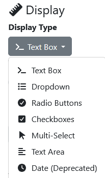
Text Box
By default a Text Box display type provides a data entry field, where values can be typed in by the operator.
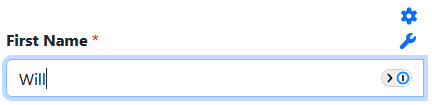
A text box is restricted to a maximum of one line of characters being entered in it. It does not support multiples lines of entered data.
A pre-processor can be used with to prefill the text box with a value.
Dropdown
The Dropdown display type is used to present a dropdown list of values to an operator
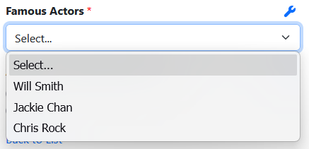
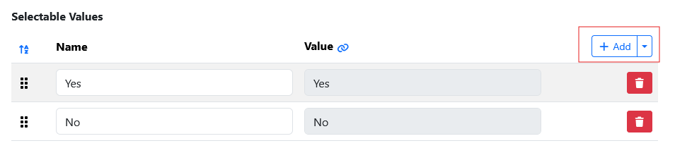
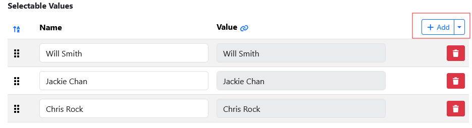
The values displayed in the list are configured using the Add button on the Values tab shown below.
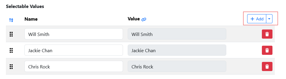
This display type is ideal where you have small short lists of static values to display to an operator.
Radio Buttons
The Radio Button display type provides radio button selection values to an operator.

The radio button values are configured by using the Add button on the Values tab shown below.
Checkboxes
The Checkboxes display type provides check box selection values to an operator.
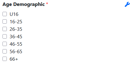
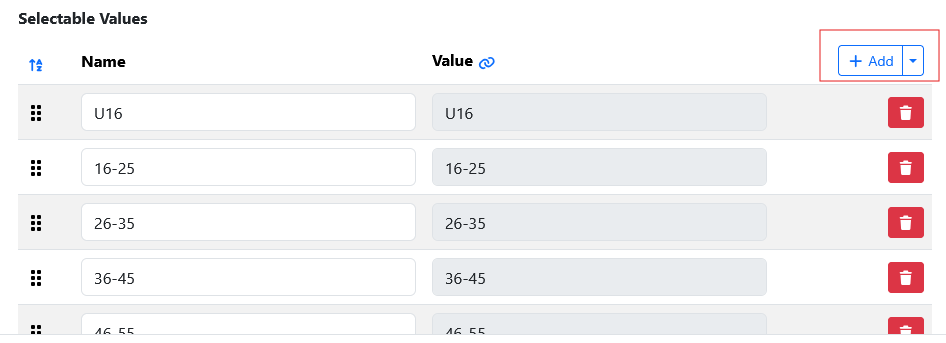
The check box values are configured by using the Add button on the Values tab shown below.
Multi-Select
The Multi-Select display type provides a multi-selectable list of values.
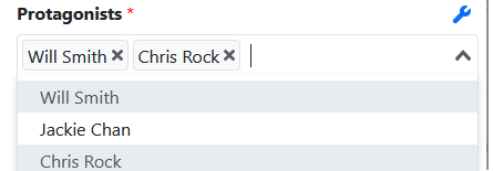
The values displayed in the list are configured using the Add button on the Values tab shown below.
Text Area
A Text Area display type accepts 1 or more lines of input.
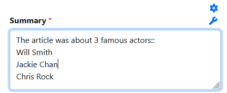
The field can be resized using the right corner to expand/coilapse the visible text area.
A pre-processor can be used with to prefill the text box with a value.
Date Deprecated
NOTE: The display type Date has been deprecated and use should not be used, instead use a regular Date field, not a Custom/Date field.