
Fields can be created and managed in one of 3 ways.
-
Using these buttons shown below:
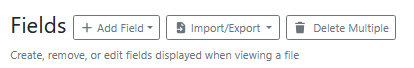
Note: Fields added by this method appear at the end of the field list.
-
Using the + button to the right of the field edit button
Note: Fields added by this method appear inserted below the selected field.
-
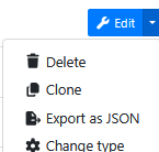
Using these Edit button drop down actions shown below:
Fields allow the collection of values from end users and are highly configurable.
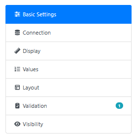
Basic Settings
All fields will contain the following basic settings:
|
Setting Name |
Description |
|---|---|
|
Name |
Name for the field displayed to the user |
|
Id |
Unique id for this field This is automatically generated based on the “Name” If a field has the same Id as a metadata value then it will load and save its value to that metadata value. |
Display
Display settings have a number of settings that are common across the different field types.
|
Setting Name |
Description |
|---|---|
|
Hide Label |
When enabled will stop the fields label from appearing above the field. |
|
Sub Header |
This text appears to the right of the field label. 
|
|
Help Text |
This text appears underneath the field. 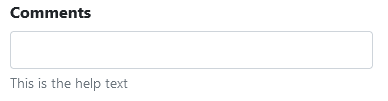
|
|
Help Bubble |
This text appears inside a tool tip that appears when the user overs over the question mark bubble to the right of the field. 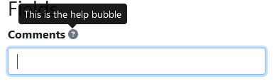
|
Values
|
Setting Name |
Description |
|---|---|
|
Default Value |
When the field is loaded on the page and it doesn’t have a value then set its value to this value. |
|
Allow Reuse value |
Enabling this option will display a reuse toggle to end users when they are processing documents. Users toggling this option will use the current value on subsequent documents processing in the same RIA page. It will override any existing or default values that exist. A common use case is batch processing where for an entire batch the values are going to be the same. |
Layout
All fields (except grids) contain the following width settings:
|
Setting Name |
Description |
|---|---|
|
Column Span |
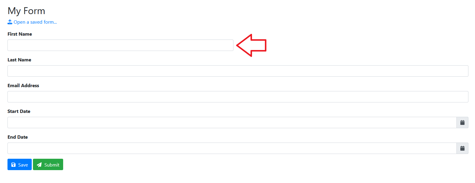
By default the area where fields are rendered is broken up into 4 columns. 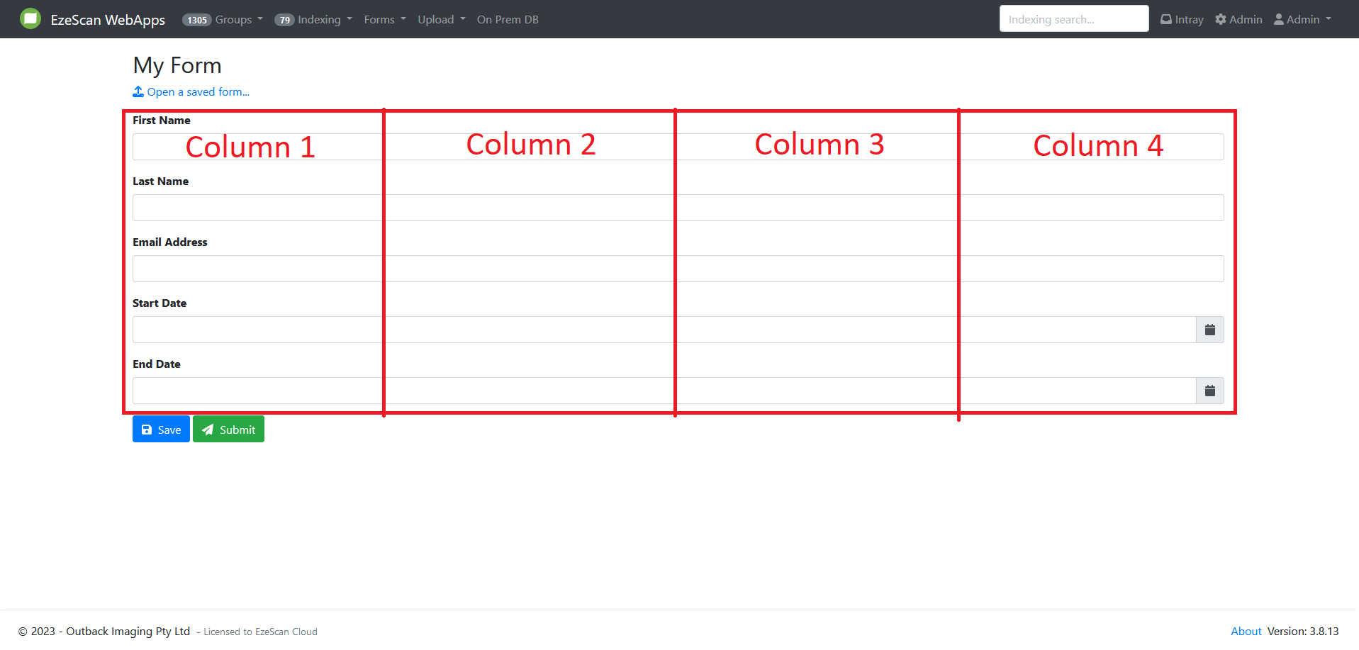
This setting allows you to set how many columns this field should span. Be default it is set to “Full Width” which is equivalent to 4 columns. For example setting this to 2 columns would make the field occupy half of the width. 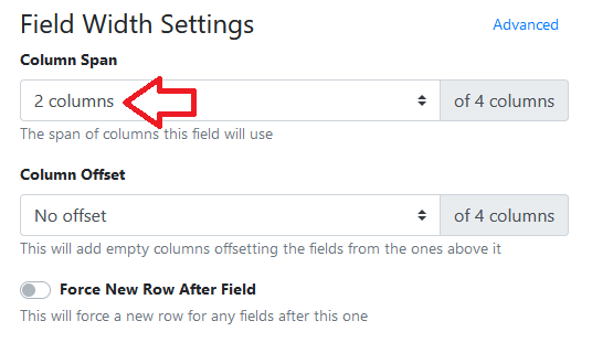
|
|
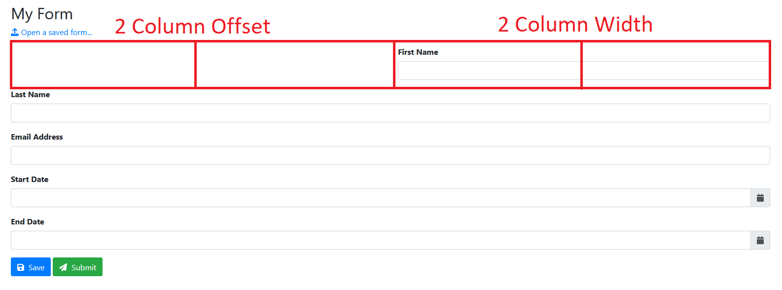
Column Offset |
This setting allows you to set how many columns this field should be offset from the left. For example setting a field to 2 column offset and then 2 column width would make it half the size of the area and right align it. 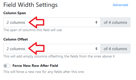
|
|
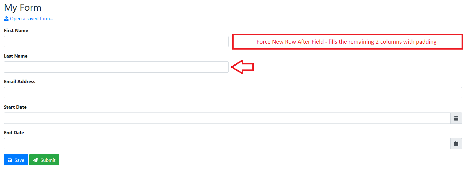
Force New Row After Field |
This setting adds padding to any columns that would be “empty” to the right of the field. For example say you had 2 fields each configured with 2 column width then they would display on the same line. 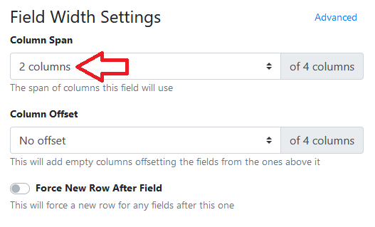
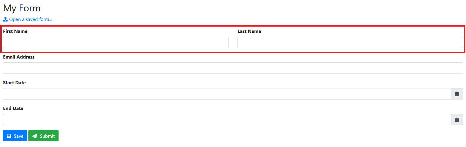
By enabling this option on the first field we can force the 2nd field down to the next line. 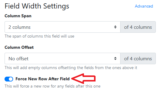
|
By default in simple mode the column span, column offset and force new row after field settings get ignored when scaling down to small screen sizes.
Using the Advanced mode you get access to control the layout at difference screen sizes.
Options appear for Small, Medium and Large column settings when you click the Advanced option.
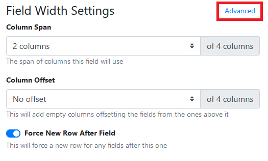
When using advanced mode its important to think about the usability of your field layout across all device screen sizes.
Validation
Fields can be validated by adding any number of validation rules.
Certain fields will have access to certain rules.
Validation rules are evaluated sequentially until one of them fails and then is then displayed to the user.
Validation rules are run after a value changes and again when an action requiring validation is clicked.
Visibility
Fields can be shown/hidden by adding any number of visibility rules.
Visibility rules are evaluated sequentially and by default will evaluate all rules.
Visibility rules are evaluated after the value of a related field is changed.
When a field is hidden it’s validation rules are no longer executed or enforced.
Values of fields that are hidden when the page is submitted will not be included in the payload.
|
Setting Name |
Description |
|---|---|
|
Hidden |
When the page loads hide the field from view |